
Python for scientific use. Part I: Data Visualization
Motivation and outline
A first step towards qualitative understanding and interpretation of scientific data is visualization of the data. Also, in order to reach a quantitative understanding, the data needs to be analyzed, e.g. by fitting a physical model to the data. The raw data may also require some initial processing in order to become useful, e.g. filtering, scaling, calibration etc.
Several open source programs for data analysis and visualization exist: gnuplot, grace, octave, R, and scigraphica. Each of these has its own pros and cons. However, it seems like you always end up using more than one program to cover all the different needs mentioned above, at least if you don't have the programming abilities to write your own custom programs using e.g., Fortran or C.
Recently, I came across Python and found it to be a very powerful tool. In this article, I would like to share my experience and illustrate that even with basic (or less) programming skills it is still possible to create some very useful applications for data analysis and visualization using this language. The article is centered around a few illustrative examples and covers the visualization part — data analysis will be covered in a future article.
Python: a brief review
Python was originally created by Guido van Rossum and is an interpreted programming language (like e.g. Perl) with a clear and easy-to-read syntax. You can write stand-alone applications with Python, but one of it's strengths is its ability to act as glue between different kinds of programs.
The standard introduction to any programming language is the
Hello world! program. In Python this is generated by first
opening the Python interpreter by typing python on the
command line. Your screen should look something like this:
Python 2.3.4 (#1, Jan 21 2005, 11:24:24)
[GCC 3.3.3 20040412 (Gentoo Linux 3.3.3-r6, ssp-3.3.2-2, pie-8.7.6)] on linux2
Type "help", "copyright", "credits" or "license" for more information.
>>>
Then the following code is typed:
print "Hello world!"
Python code can also be stored in a file e.g. named
script.py. By convention, files containing python code
have a *.py extension. The script can be executed by
typing python script.py on the command line. The
program output will then be written to stdout and appear on the
screen. If the following line is added to the top of the file:
#! /usr/bin/python
(assuming that the python executable or a symlink to it exists)
and giving the file executable mode with chmod u+x
script.py the script can be executed by typing
./script.py on the command line.
Python comes with many modules, either built-in or available for separate download and installation. In this article we will use SciPy, which is a very powerful library of modules for data visualization, manipulation and analysis. It adds functionality to Python making it comparable to e.g. octave and matlab.
Plotting 2-D data
Example 1: Plotting x,y data
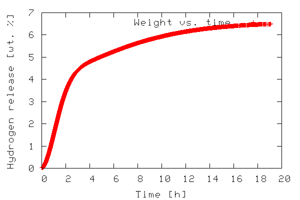
The first example illustrates plotting a 2-D dataset. The data to be plotted is included in the file tgdata.dat and represents weight loss (in wt. %) as a function of time. The plotting routine is in the file tgdata.py and the python code is listed below. Line numbers have been added for readability.
     1  from scipy import *
     2
     3  data=io.array_import.read_array('tgdata.dat')
     4  plotfile='tgdata.png'
     5
     6  gplt.plot(data[:,0],data[:,1],'title "Weight vs. time" with points')
     7  gplt.xtitle('Time [h]')
     8  gplt.ytitle('Hydrogen release [wt. %]')
     9  gplt.grid("off")
    10  gplt.output(plotfile,'png medium transparent picsize 600 400')
To run the code, download the tgdata.py.txt file, rename it
to tgdata.py, and run it with python
tgdata.py. Besides Python, you also need SciPy and gnuplot
installed. Gnuplot version 4.0 was used throughout this article.
The output of the program is a plot to screen as shown below.
The plot is also saved to disk as tgdata.png per line
4 above.
In line 1, everything from the SciPy module is imported. In order
to make use of the various functions of a module, the module needs
to be imported by adding an import module-name line to
the the python script. In this case it might have been sufficient
to import only the gplt package and the
io.array_import package. In line 3 the
io.array_import package is used to import the data
file tgdata.dat into the variable called
data as an array with the independent variable stored
in column 0 (note that array indices start with 0 as in C unlike
Fortran/Octave/Matlab where it starts at 1) and the dependent
variable in column 1. In line 4 a variable containing the file name
(a string) to which the plot should be stored. In line 6-10 the
gplt package is used as an interface to drive gnuplot.
Line 6 tells gnuplot to use column 0 as x-values and column 1 as
y-values. The notation data[:,0] means: use/print all
rows in column 0. On the other hand data[0,:] refers
to all columns in the first row.
The gnuplot png option picsize can be a little
tricky. The example shown above works when Gnuplot is built with
libpng + zlib. If you have Gnuplot built with
libgd the required syntax becomes size
and the specified width and height should be comma separated.
In order to plot a file with a different file name, we have to open the python source in a text editor and manually change the name of the file to be imported. We also need to change the name of the file copy if we do not want to overwrite the previous plot. This is a little tedious. We can easily add this functionality to our python script by allowing filenames to be passed as command line arguments. The modified script is called tgdata1.py and is shown below.
     1  import sys, glob
     2  from scipy import *
     3
     4  plotfile = 'plot.png'
     5
     6  if len(sys.argv) > 2:
     7          plotfile = sys.argv[2]
     8  if len(sys.argv) > 1:
     9          datafile = sys.argv[1]
    10  else:
    11          print "No data file name given. Please enter"
    12          datafile = raw_input("-> ")
    13  if len(sys.argv) <= 2:
    14          print "No output file specified using default (plot.png)"
    15  if len(glob.glob(datafile))==0:
    16          print "Data file %s not found. Exiting" % datafile
    17          sys.exit()
    18
    19  data=io.array_import.read_array(datafile)
    20
    21  gplt.plot(data[:,0],data[:,1],'title "Weight vs. time" with points')
    22  gplt.xtitle('Time [h]')
    23  gplt.ytitle('Hydrogen release [wt. %]')
    24  gplt.grid("off")
    25  gplt.output(plotfile,'png medium transparent picsize 600 400')
In the first line we have imported two new modules —
sys and glob — in order to add the
desired flexibility. In Python, sys.argv contains the
command line arguments when execution starts.
sys.argv[0] contains the filename of the python script
executed, sys.argv[1] contains the first command line
argument, sys.argv[2] contains the second command line
argument and so on. The glob.glob() function behaves
as ls in *nix environments in that it supplies
filename wildcarding. If no matches are found it returns the empty
list (and thus has a len() of zero), otherwise it contains a list
of matching filenames. The script can be executed with any desired
number of command line arguments. If executed with two arguments
e.g. python tgdata1.py tgdata.dat tgdata1.png the
first argument is the name of the file containing the data to be
plotted, and the second argument is the desired name of the file
copy of the plot.
The script works as follows. A default file name for the hard
copy of the plot is stored in the variable plotfile
(line 4). Then some conditions about the number of given command
line arguments are checked. First, if two or more command line
arguments are given plotfile is overwritten with
argument no. 2 (line 6-7.) Any arguments after the second are
silently ignored. For 1 or more arguments given argument 1 is used
as the data file name (line 8-9). If no command line arguments are
passed, the user is prompted to input the name of the data file
(line 10-12). In case of an invalid file name being used for the
data file the script prints an error message and exits.
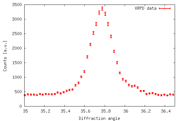
Example 2: Plotting x,y data with error bars
So far we have shown that the gplt package is easy
to interface with gnuplot and very effective. However, for
scientific use it is often desirable to represent uncertainties for
each data point. Although this is possible in gnuplot the
gplt interface lacks this functionality. Instead we
use the popen package included in the os
module. With popen it is possible connect to the stdin
(or stdout) of a program through a pipe.
The code below (also available in xrddata.py.txt, the data file
is available as xrddata.dat) more or less shows
how example 1 is reproduced using popen instead of the
gplt package. The major difference is the fact that
with popen it is not necessary to import the data to
be plotted into Python - instead it is read directly by
gnuplot.
     1  import os
     2
     3  DATAFILE='xrddata.dat'
     4  PLOTFILE='xrddata.png'
     5  LOWER=35
     6  UPPER=36.5
     7
     8  f=os.popen('gnuplot' ,'w')
     9  print >>f, "set xrange [%f:%f]" % (LOWER,UPPER)
    10  print >>f, "set xlabel 'Diffraction angle'; set ylabel 'Counts [a.u.]'"
    11  print >>f, "plot '%s' using 1:2:(sqrt($2)) with errorbars title 'XRPD data' lw 3" % DATAFILE
    12  print >>f, "set terminal png large transparent size 600,400; set out '%s'" % PLOTFILE
    13  print >>f, "pause 2; replot"
    14  f.flush()
The code of example 2 produces the output shown below. The error
bar plot is created with plot 'filename' using 1:2:(sqrt($2))
with errorbars because in xrddata.dat the standard
deviations are equal to the square root of the y-values. This is a
special case and usually errors are given explicitly as a third
data column in the data file. Thus, an error bar plot is created
with plot 'filename' using 1:2:3 with errorbars.
Plotting 3D-data
Example 3:
Now we look at how 3-D data can be represented by using a combination of Python/gnuplot. In order for gnuplot to represent 3-D data it requires that the data is either given by a mathematical expression or stored in a data file. The data file should have either a matrix-format where z-values are given as a matrix with x and y equal to the row and column number, respectively, corresponding to each z-value or a 3 column format where each row represents a data triple with x, y, and z given by the 1., 2., and 3. column respectively. See the gnuplot manual for further details.
The data to be represented in a 3-D fashion in this example is actually a collection of 2-D data files (like the one shown in example 2). Each data file corresponds to an experiment at a different time (with 150 s intervals between experiments) so we have two independent variables and one dependent variable: x(file number/time), y (diffraction angle),and z(counts) distributed across several files. This makes the 3-D data not suitable for plotting — yet.
The script 3ddata_1.py shown below finds
all files with a given extension (*.x_y in this case) in the
current working directory and creates a list containing their file
names (line 5, FILELIST). In line 6 the number of data
rows in each file is determined (SIZEX). This
information, including the number of data files, is then used to
construct an array (DATAMATRIX) with a size of
SIZEX by len(FILELIST). In lines 11-12 we
cycle through the data files copying the second column in datafile
number y is copied to column number y in DATAMATRIX.
The array now holds all z-values. This array is only temporary,
suitable for data processing before the actual data file for the
3-D plotting is written.
In line 14-22 the data file is written in the (x,y,z) format
with x corresponding to time (found by multiplying the file number
with the time step), y corresponding to diffraction angle as given
by TWOTHETA, z corresponding to counts. In this case
we only want to plot the data with diffraction angles between 35-60
(corresponding to data rows 1126-1968). Therefore, only this range
is written to file in order to speed up both the process of writing
to file and the plotting. In line 24-29 gnuplot is fed input using
the popen package.
     1  import os, glob
     2  from scipy import *
     3
     4  EXT='*.x_y'
     5  FILELIST=glob.glob(EXT)
     6  SIZEX = len(io.array_import.read_array(FILELIST[0]))
     7  DATAMATRIX = zeros((SIZEX,len(FILELIST)), Float)
     8  TWOTHETA=io.array_import.read_array(FILELIST[0])[:,0]
     9  TIMESTEP=150
    10
    11  for y in range(len(FILELIST)):
    12                  DATAMATRIX[:,y]=sqrt(io.array_import.read_array(FILELIST[y])[:,1])
    13
    14  file = open("3ddata.dat", "w")
    15
    16  for y in range(len(FILELIST)):
    17          for x in range(1126,1968):
    18                  file.write(repr(TIMESTEP*y)+" "\
    19                  +repr(TWOTHETA[x])+" "+repr(DATAMATRIX[x,y]))
    20                  file.write("\n")
    21          file.write("\n")
    22  file.close()
    23
    24  f=os.popen('gnuplot' ,'w')
    25  print >>f, "set ticslevel 0.0 ;set xlabel 'Time [s]'; set ylabel 'Diffraction angle'"
    26  print >>f, "set pm3d; unset surface; set view 60,75; splot '3ddata.dat' notitle"
    27  print >>f, "set terminal png large transparent size 600,400; set out '3ddata_1.png'"
    28  print >>f, "replot"
    29  f.flush()
If you wanted to write a 3-D data file in the matrix-format, lines 14 through 22 can be replaced with the following code.
file = open("3ddata_matrix.dat", "w")
for x in range(SIZEX):
        for y in range(len(FILELIST)):
                file.write(repr(DATAMATRIX[x,y])+" ")
        file.write("\n")
file.close()
The 3-D plot produced by the above script is shown below.
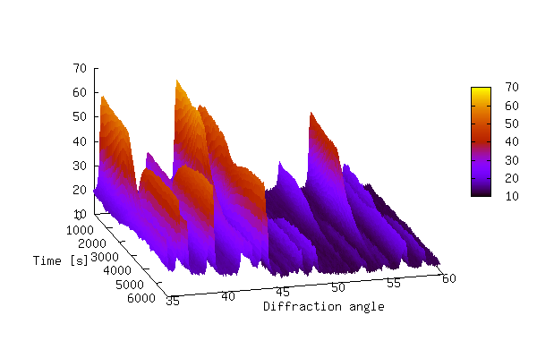
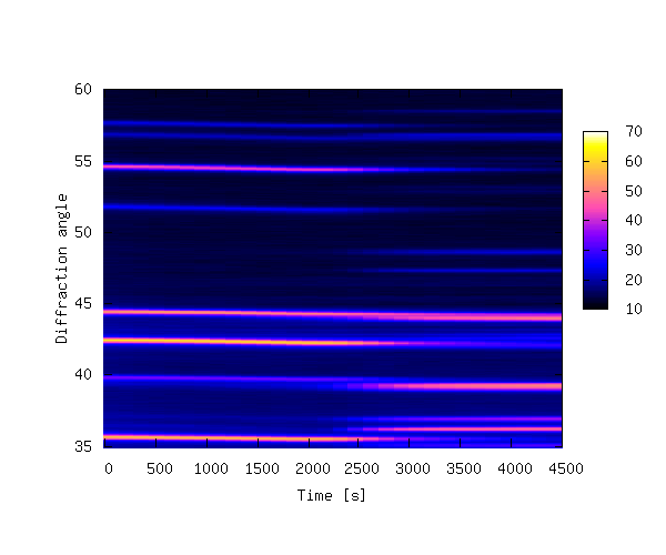
The plot above shows that it can be difficult to produce a 3-D plot of non-monotonic data that shows all of the details of the data — some of the smaller peaks are hidden behind larger peaks. It is also difficult to see changes in peak positions as a function of time. In order to bring out these details it is sometimes better to create a 2-D contour plot by projecting the z-values down into the x,y plane. This is achieved by replacing lines 24-29 of 3ddata_1.py with the code below (3ddata_2.py).
f=os.popen('gnuplot' ,'w')
print >>f, "set pm3d map; set palette rgbformulae 30,31,32; set xrange[0:4500]"
print >>f, "set xlabel 'Time [s]'; set ylabel 'Diffraction angle'"
print >>f, "splot '3ddata.dat' notitle"
print >>f, "set terminal png large transparent size 600,500; set out '3ddata.png'"
print >>f, "replot"
f.flush()
The contour plot is shown below.
The 3-D example plots were made with 39 data files, each containing 4096
data rows. The data files are available at this offsite
link, and can be unpacked with tar xvfz 3ddata.tar.gz.
Summary
In this article a few examples have been given in order to
illustrate that Python is indeed a powerful tool for visualization
of scientific data by combining the plotting power of gnuplot with
the power of a real programming language. It should be noted that
all the examples given here could probably have been solved with a
combination of e.g. bash, gawk and
gnuplot. It appears to me that Python is much simpler and the
resulting scripts are more transparent and easy to read and
maintain. If heavy data processing is required the
bash/gawk/gnuplot might also need the added functionality of e.g.
octave. With Python this functionality is in SciPy.
Suggestions for further reading
Manuals, Tutorials, Books etc:
- Guido van Rossum, Python tutorial, http://docs.python.org/tut/tut.html
- Guido van Rossum, Python library reference, http://docs.python.org/lib/lib.html
- Mark Pilgrim, Dive into Python, http://diveintopython.org/toc/index.html
- Thomas Williams & Colin Kelley, Gnuplot - An Interactive Plotting Program, http://www.gnuplot.info/docs/gnuplot.html
- Travis E. Oliphant, SciPy tutorial, http://www.scipy.org/documentation/tutorial.pdf
- David Ascher, Paul F. Dubois, Konrad Hinsen, Jim Hugunin and Travis Oliphant, Numerical Python, http://numeric.scipy.org/numpydoc/numdoc.htm
See also previous articles about Python published in LG.
Other graphical libraries for Python
Gnuplot version 4.0 has been used in the examples throughout this article. Python also works with other plotting engines/libraries:
- Grace, see http://www.idyll.org/~n8gray/code/
- PGPLOT, see http://efault.net/npat/hacks/ppgplot/
- PLplot, see http://www.plplot.org/
- matplotlib, see http://matplotlib.sourceforge.net/ (library specifically made for Python)
Anders has been using Linux for about 6 years. He started out with RH
6.2, moved on to RH 7.0, 7.1, 8.0, Knoppix, has been experimenting a little
with Mandrake, Slackware, and FreeBSD, and is now running Gentoo on his
workstation (no dual boot :-) at work and Debian Sarge on his laptop at
home. Anders has (a little) programming experience in C, Pascal, Bash,
HTML, LaTeX, Python, and Matlab/Octave.
Anders has a Masters degree in Chemical Engineering and is currently
employed as a Ph.D. student at the Materials Research Department, Risö
National Laborary in Denmark. Anders is also the webmaster of Hydrogen storage at Risö.
![[BIO]](../gx/authors/andreasen.jpg)
