Design Awareness
By Mark Seymour
Another bout of logorrhea
Snow is no longer falling outside my window and it's officially Spring, so a man's thoughts naturally turn to a new pair of blue jeans. (For the purposes of this column, anyway.) To celebrate, we'll create one or two logos for a new blue jeans manufacturer called Pants On Fire.
But first let's examine a common household product whose logo has recently undergone a redesign, and analyze the change.
Cooking for oneself, you sometimes end up reaching for a can of something. Here's a list of Hormel products, with their industry classifications, some of which might be in your cupboard:
Deli
DI LUSSO™ Deli Products
HORMEL™ Snack Size Deli Meats & Cheese
HORMEL® Deli Beef
HORMEL® Deli Dry Sausage
HORMEL® Deli Ham
HORMEL® Deli Turkey
HORMEL® Party Trays
Ethnic
BUFALO® Authentic Mexican Products
CARAPELLI® Olive Oils
CHI-CHI'S® Mexican Products
DONA MARIA® Authentic Mexican Products
HERDEZ® Authentic Mexican Products
HOUSE OF TSANG® Asian Sauces and Oils
MARRAKESH EXPRESS® Mediterranean Products
PATAK'S® Indian Products
PELOPONNESE® Mediterranean Products
Pantry
DINTY MOORE® Products
HERB-OX® Bouillon
HORMEL® Bacon Toppings
HORMEL® Chili
HORMEL® Chunk Meats
HORMEL® KID'S KITCHEN® Microwave Meals
HORMEL® Microwave Meals and Soups
MARY KITCHEN® Hash
SPAM® Family of Products
STAGG® Chili
Refrigerated
CURE 81® Ham
HORMEL® ALWAYS TENDER® Flavored Pork, Beef, Chicken &
Turkey
HORMEL® Bacon
HORMEL® Fully Cooked Entrees
HORMEL® OLD SMOKEHOUSE™ Summer Sausage
HORMEL® Pepperoni
HORMEL® WRANGLERS® Franks
JENNIE-O TURKEY STORE®
LIGHT & LEAN® Premium Luncheon Meat
LITTLE SIZZLERS® Pork Sausage
Besides showing how acquiring companies over the years may stick you with brand names that outlive their time (though I'm sure there are food manufacturers who would kill to own SPAM), this list also illustrates the dilemma frequently confronted by designers and their clients: so many logos, so little money...
The list of 'ethnic' foods also shows how you may have to deal with cultural sensibilities when designing a suite of logos. For instance, DONA MARIA loses something in the translation when it doesn't carry the enya, that little squiggle over the 'n' in Doña, which changes it from 'Donna' to 'Donya', which means something entirely different. While Bufalo with one F means the same in Spanish as the word does in English with two Fs, it will look odd if the can isn't in the ethnic food aisle. And "Marrakesh Express" obviously didn't mean the same thing to the Hormel people when they bought or developed the brand as it did to those of us who lived through a time when you took that train (there was even a song about it) in order to purchase large quantities of a processed agricultural product that Hormel can't legally sell...
But we're going to look at just one Hormel product line: Dinty Moore. Just within this one brand, there are many varieties, including:
Canned Products
Beef Stew
Chicken & Dumplings
Chicken Stew
Meatball Stew
Turkey Stew
Microwavable Products
Beef Stew (7.5 oz cup)
Beef Stew (10 oz tray)
Chicken & Dumplings (7.5 oz cup)
Noodles & Chicken (7.5 oz cup)
Rice with Chicken (7.5 oz cup)
Scalloped Potatoes & Ham (7.5 oz cup)
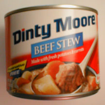
Our focus will be on the beef stew, which carries the same logotype as all the other Dinty Moore products. The brand logo is simple and, even in its 'new' incarnation, fairly traditional:
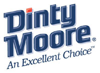
The logo, while tidied up recently, is still not very exciting nor evocative. But the use of blue as a 'food' color doesn't do anything for my appetite; I'm not sure how they got stuck with it originally, and not sure why they didn't modify it when the logo was redesigned. The blue got a little lighter, and the font 'domed' with shading, but the change was more evolutionary than revolutionary.
Left unstated, even on its own webpage, is all the 'back story': who the hell is Dinty Moore, and why should we care? The official Hormel history page merely mentions its beginning as a brand name in 1935. Apparently Dinty was a real person, even though the story is a little complicated.
|
|
|
|
| Original packaging | Revised packaging |
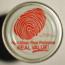
But its Dinty Moore's finger that we're talking about here. It was there the last time I bought a can, a big red fingerprint right on the lid, but it's gone from the new one. The story behind that print might have been interesting, but it too is not in evidence anywhere.
[ So that's where that finger came from! The people at Wendy's have been wondering... -- Ben ]
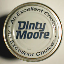
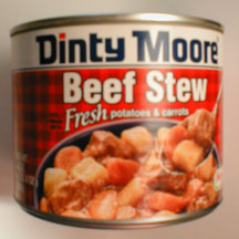
As the photo shows, it was labeled as the "Dinty Moore Mark of Product Quality" but what, if anything, that had to do with Dinty's approval of the contents, I'm not sure. What a three-inch fingerprint had to do with anything, I'm also not sure, but the second series of photos shows that the designers couldn't figure that out, either, and took it off. The entire color way of the can has shifted as well, especially on the top, from red toward blue; someone at Hormel likes blue, I guess. Maybe it tests well...
For the writers among us, there were a few interesting wording changes as well: the old can read "still made with Fresh potatoes & carrots", while the new label has the contents just "Made with fresh potatoes & carrots". An all-red "no preservatives" slugline fell off the back of the old label and now appears inside three oddly shaped trapezoids (one yellow with black letters, one blue with white letters, and one in black with no text for no apparent reason) on the front of the new label; some lawyer's idea, no doubt. The shift to all caps for "BEEF STEW" and "FREE" would get a zing from my old professor, Arnold Bank, so I'm giving one to them in his absence; it may fit the box better, but it doesn't make it easier to read.
A last little design note, one dear to my heart: where to put the "registered trademark" symbol.
On the original logo, the ® was above the top curve of the 'e' at the end. On the redesigned logo, it hangs off the spur of the 'e' on the baseline. Neither is better than the other, but it's one of the niceties of logo design that always needs to be addressed.
(Meaningless but important note: In the 'good things on the Internet' category, my new favorite URL name has to be http://www.thesegoto11.com/ The phrase These go to eleven refers to a scene in Rob Reiner's movie Spinal Tap; if you haven't seen this classic rock & roll spoof, you should. The logo's pretty darn good, too.)
Now for a few logos and logotypes for our imaginary blue jeans company, Pants On Fire, Inc. (a friend of mine became its president when he said one thing and did another once too often...) It's a classic childhood phrase, and I'm surprised it hasn't been snatched up already. (If there's some little boutique jeans store in Hollywood using the name, my apologies; you didn't show up in a Google search.)
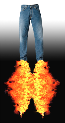
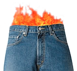
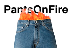
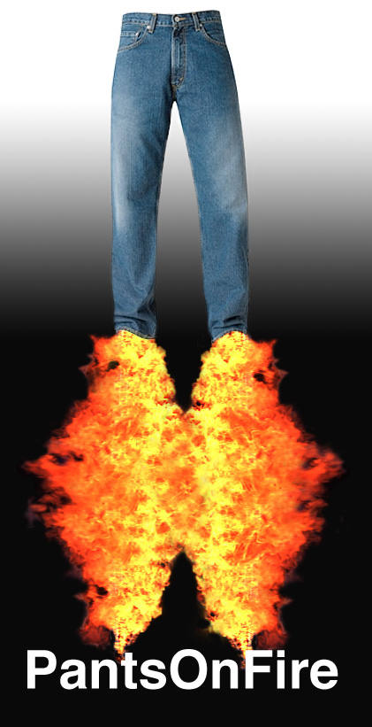
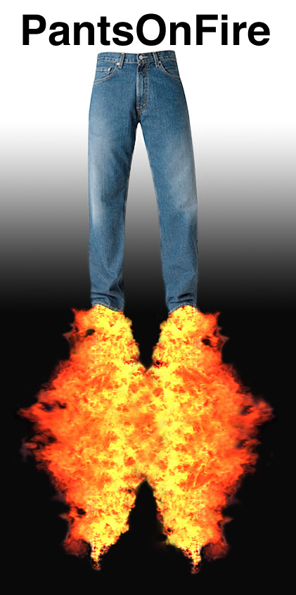
The imagery for the logo/logotypes is obvious: pants and/or fire. We can use them by themselves (a logo), to create emphasis for text (a logotype), or as a combination of images and text.
Here are several Pants On Fire logos, a narrow one and a squarer variant:
|
|
|
(see a larger image here)
|
|
Here are a pair of logotypes (neither of which I'm really happy with, but this column is due):
|
|

|
|
(see larger images here)
|
|
Here are several combination logos:

|
|
|
|
|
|
|
(see larger images here)
|
|
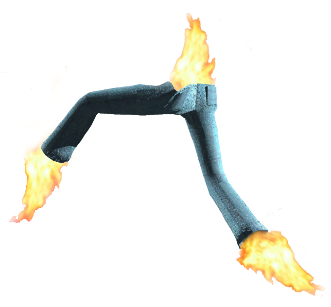
And here's even a rudimentary logo in 3D (courtesy of my old friend Kelley, the modeling whiz):
|
|
(see a larger image here)
|
These, of course, do not begin to cover the spectrum of possible combinations using the company name and imagery relating to the concept and the wording and the products. Just the choice of font(s), let alone the many variations of weight and style, would be a long and difficult process. (I wimped out here and, in the interest of getting done on schedule, just went with Helvetica Bold.) Trying to design for all the possible usages of the logo (pants labels, tags, corporate identity print, signage, trucks, on-line, television, posters, the list is endless) would limit some of the wilder choices, but drive others: should the logo be able to stand alone as well as with text, how small will it be legible, how many or how few colors can it be represented with, etc.
There might well be sub-brands, such as UnderPants On Fire, that I will leave to your imagination. (If you come up with a good logo for it, of course, send it along.)
Then there's the Spanish language market (Pantalones en el fuego), along with the rest of the world (Dutch: Broek op Brand, French: Pantalon sur le feu, German: Hosen auf Feuer, Italian: Pantaloni su fuoco, and so on). Care would have to be taken, of course, to work with native language speakers to see if the phrase meant anything remotely similar. Note, too, that some languages capitalize many words and some do not; that can seriously alter if and how you translate a logo. Many companies do not translate their brand names, and rely on the globalization of the marketplace to compensate.
I hope this column has given you some more logo issues to chew on. As ever, if there are specifics you'd like covered, let me know.
I started doing graphic design in junior high school, when it was still
the Dark Ages of technology. Bill Gates and Steve Jobs were both eleven
years old, and the state of the art was typing copy on Gestetner masters.
I've worked on every new technology since, but I still own an X-acto knife
and know how to use it.
I've been a freelancer, and worked in advertising agencies, printing
companies, publishing houses, and marketing organizations in major
corporations. I also did a dozen years [1985-1997] at Apple Computer; my
first Macintosh was a Lisa with an astounding 1MB of memory, and my current
one is a Cube with a flat screen.
I've had a website up since 1997, and created my latest one in 2004. I'm
still, painfully, learning how web design is different from, but not
necessarily better than, print.
![[BIO]](../gx/authors/seymour.jpg)

